
The meaning of our logo.
Xpand-Net stands for controlled expansion. Not growth for the sake of growth, but helping customers expand capability, resilience, and confidence without losing control of what matters most.
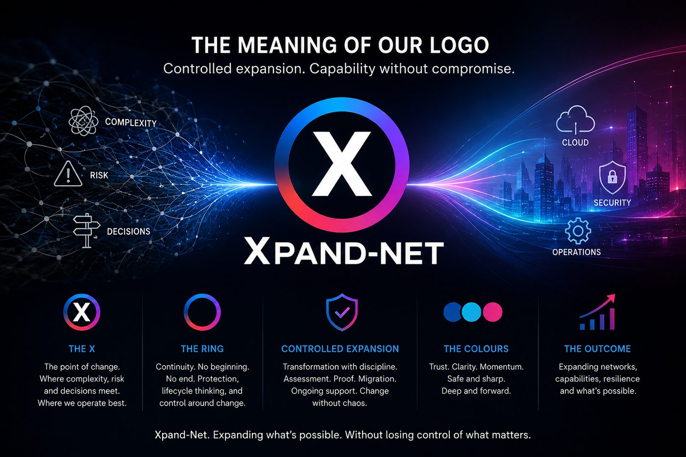
The X marks transformation. The ring stands for continuity and control.
The X is the point of change. It represents the moment where complexity, risk, and decision-making meet. That is where Xpand-Net operates best: in high-stakes environments where transformation has to be handled with precision.
The ring represents continuity. It has no clear beginning and no end, which reflects the reality of modern infrastructure. Networks, security, cloud, and operations are never finished. They evolve continuously. The ring signals protection, lifecycle thinking, and an always-on responsibility to keep customers secure, stable, and ready for what comes next.
The ring around the X also means control around change. Transformation can be disruptive, but Xpand-Net puts discipline around it. Assessment, proof, migration, and ongoing support all sit around the core challenge, helping customers move forward without chaos.
The colors tell the same story.
Deep blue tones
Trust, engineering depth and calm under pressure.
Cyan
Technical clarity and a future-facing edge.
Magenta
Motion, urgency and forward momentum.
Together, they show a business that is both safe and sharp: trusted enough for mission-critical work, modern enough to lead customers through change.
The name Xpand-Net says what the business does. It is about expanding networks, capabilities, resilience, and outcomes, and expanding what customers think is possible when they have the right specialist partner beside them.
Expand with confidence.
Xpand-Net exists to help customers expand with confidence in environments where failure is not an option.